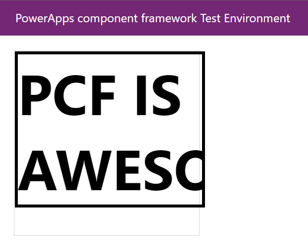
You could be forgiven if you thought that the overall div container that the Power Apps Component Framework gives you would constrain your control to the outer boundary. You might also think that you'd automatically get the runtime height and width of your control when you asked for it.
The bad news is that neither of those are true without a little extra work in your control code. The good news is both of them are fixable in just a line of code or two.
First, fixing the outer border. Adding an overflow: hidden or overflow: scroll to your container's CSS won't necessarily fix it on it's own, but it is necessary.
/*
  FYI this CSS is sitting in the background. It's laying things out, but anything
  meaningful to what we're talking about is in the TypeScript code below.
*/

.isAwesome {
  text-align: left;
  font-size:76px;
  border:4px solid black;
  font-weight: bold;
}
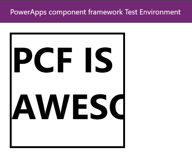
In order to get overflow to behave nicely, you need to provide a height & width for your container. On top of that, in order to get updated height & width info from PCF when it changes (if someone resizes a window, rotates their phone, etc), you need to add a call to context.mode.trackContainerResize, setting that to true. After that point, PCF will keep the allocatedHeight and allocatedWidth properties up to date and accurate.

Perfect! Well, sort of. I'll leave making it pretty up to you.
Want to learn more? Check these out:


